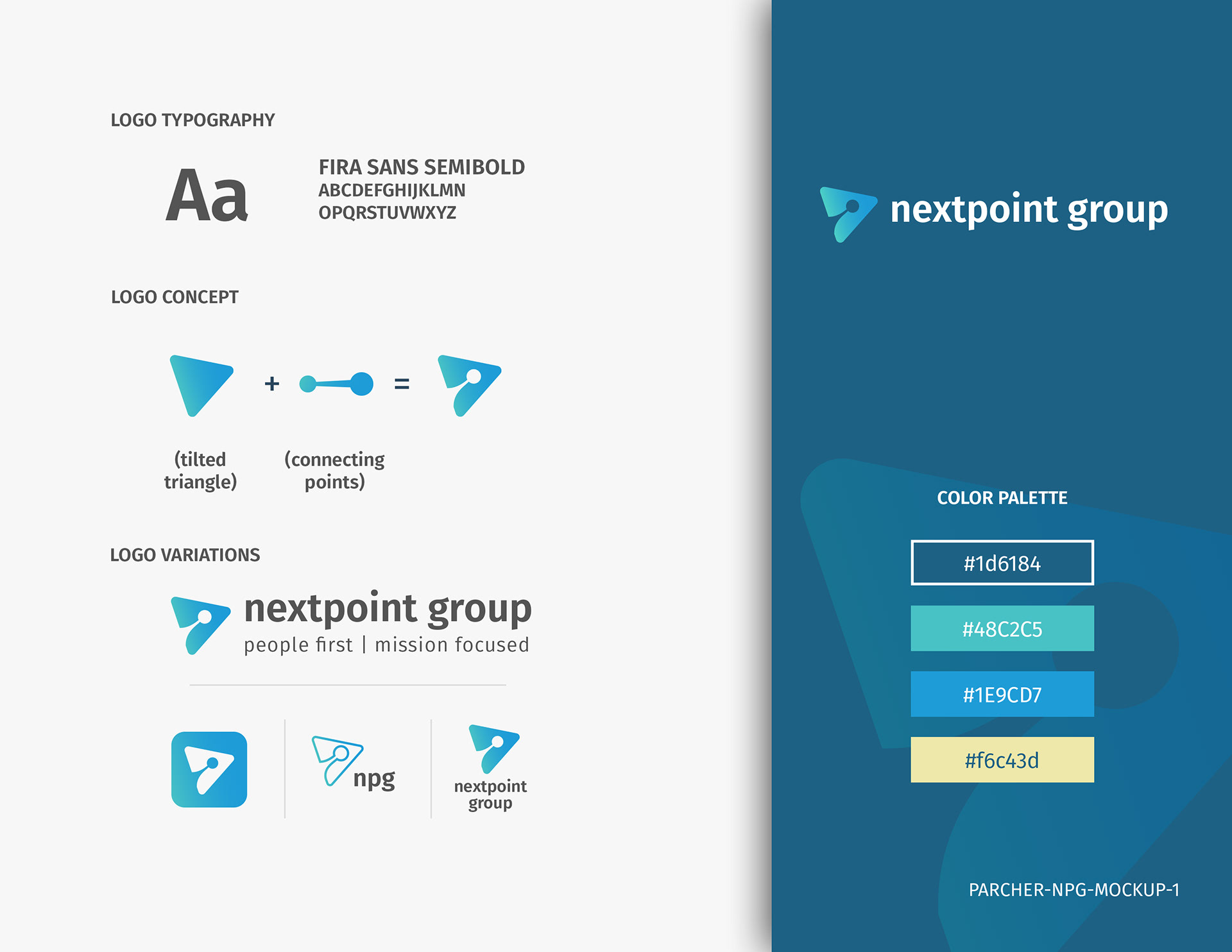
For this design, I focused on updating the legacy logomark of the two connecting points. The point is surrounded by a tilted triangle, which emphasizes progress and innovation. "Fira Sans" was chosen as the typeface due to its clean and open design. The all-lowercase logotype aligns with modern design principles of simplicity and minimalism.